
In the Annex: Amanda Hill, Shany Porras, and Anne Russell
This March opened our Annex exhibition series offering a unique view into the experience of the everyday. Through painting and printmaking, artists Amanda Hill, Shany Porras, and Anne Russell bring their distinct perspectives to the human experience by exploring our relationships to commonplace objects, forms, and music.
In light of the coronavirus, we are taking all precautions to protect the well-being of our community. Therefore this exhibition is extended through April 26th, and is currently on view by appointment only. Please contact director@fsfaboston.com to schedule an appointment. We will keep you updated as the situation changes. Apologies in advance for any unforeseen inconveniences.
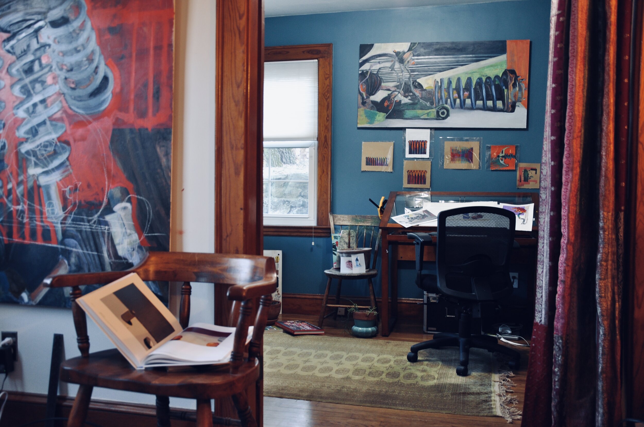
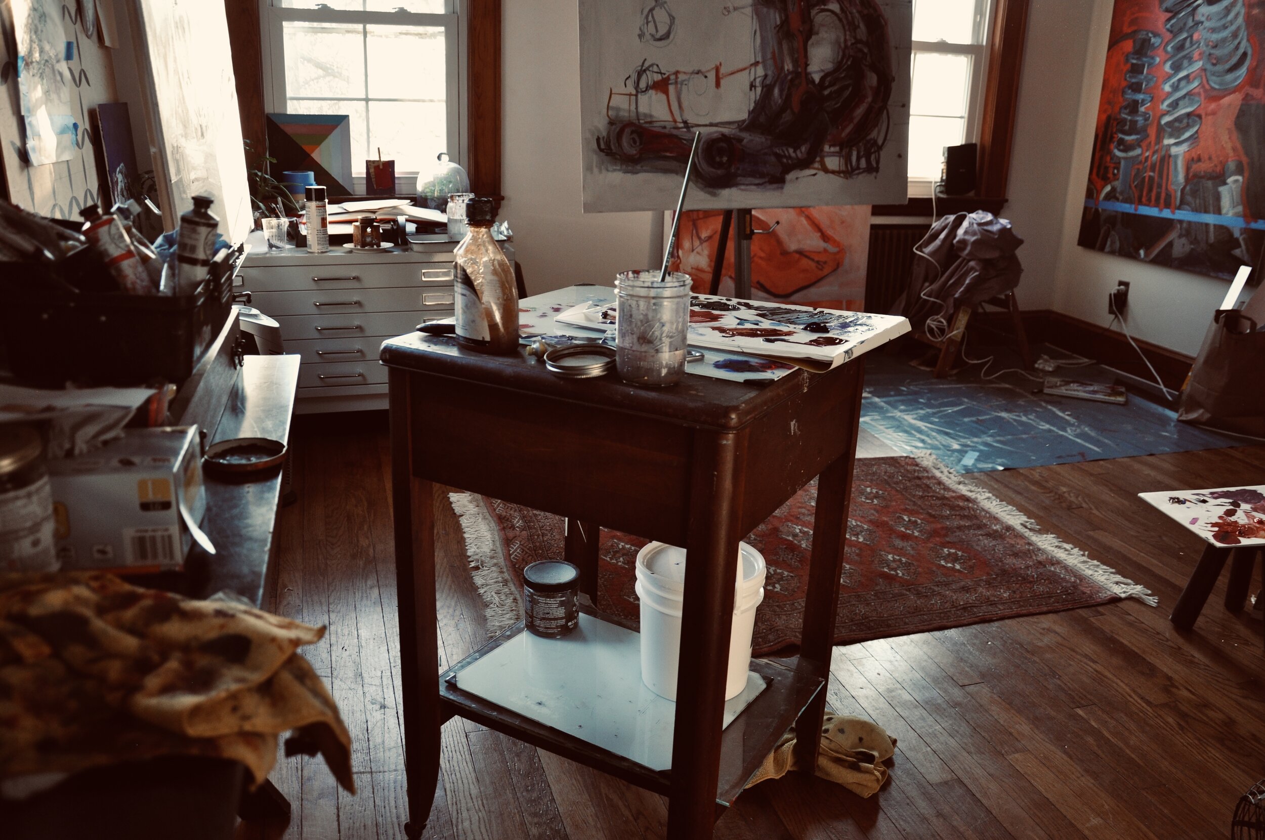
However, in order to bring you a wider virtual experience the show is now available via our online shop. Please enjoy the expanded online experience of our exhibitions, and enjoy the studio views, the process and the history behind the work of Amanda Hill, Shany Porras, and Anne Russell below.
Amanda Hill
My daily practice is still developing—shifting and flexing with my other responsibilities. I took a major hiatus from my artwork, while I completed graduate school and pursued other more administrative-based efforts. After five years, the desire to return to my practice had only intensified, and I started painting again in 2018—exchanging a medium of spreadsheets and calendars for paint. It has, and continues to be, a strange transition to say the least.
When I am working, I usually start by completing smaller sketches. I almost always start drawing before painting. Once I start on a larger piece, it usually goes through an “ugly-stage” as I block in objects and colors. Recently, I noticed that when I get stuck, I start sketching from the painting—reworking composition and color. Painting, like much of my artwork, has always been about process, achieving a meditative state of operation. One of the most important pieces of my practice also revolves around the study of others’ work. Right now, I have been looking at the works of Raimonds Staprans, Hyman Bloom, Sainer, Francis Bacon, and Andrew Hem.
The “parts” series I have been working on stems from many different places—ecological concerns, my interest in intricate objects, and the play of invented color. In many of my works, these discarded mechanical objects turn figurative and skeletal. SHOP AMANDA HILL ➢
Shany Porras
My current paintings are translations of music into abstract paintings. These translations came about as I was looking inside myself for what to paint. What would be my muse? And how would I paint it? I remember a wise college professor who advised me to “paint what you know” while I was pursuing my B.F.A. at Rice University. At the time, I thought I didn’t know anything, really, so my paintings were disjointed. I was young and inexperienced. Now, well into adulthood, I finally see the connection of my love for music and abstract art. I also know that I have played the role of translator throughout my life. Early on I translated English to Spanish for my Mom when we first moved to the USA. Then, professionally, I took on roles that benefitted from my ability to translate technology into regular business terms. Now as an artist I choose to translate music, which is inherently abstract, into paintings.
in the studio my creative process is straight forward and I use project phases to keep me focused. I select music that has meaning to me either because I’ve performed it before or because it has moved me emotionally. I start by listening to a piece repeatedly (with my headphones so I don’t bother the other artists in my studio building) before I start to paint or sketch and I will listen to multiple performances. As part of this investigative stage, I also research the composer, the history around the piece, and the various performances throughout history. I will typically have a music score where I can make notes and sketches as I start to visualize colors and gestures. Once I have a strong grasp of the music and the types of paintings I want to make, I will lay out a plan for the number of paintings I will make and the materials I will use, (my primary material is acrylic paint and mediums) based on the parts of the music I want to translate. Then I begin the painting process by establishing the surfaces I need creating smooth or rough textures, and create the preliminary marks and colors. I develop the pieces through further listening while I add layers of paint and marks. Often, if I have gone astray from the translation, I will scrape back or sand down the paint so that I can be more precise in the translation. This creative period is iterative, but does eventually get me to a point where I can reflect on the painting as an observer. I like to ensure that I have created an honest reflection of the music.
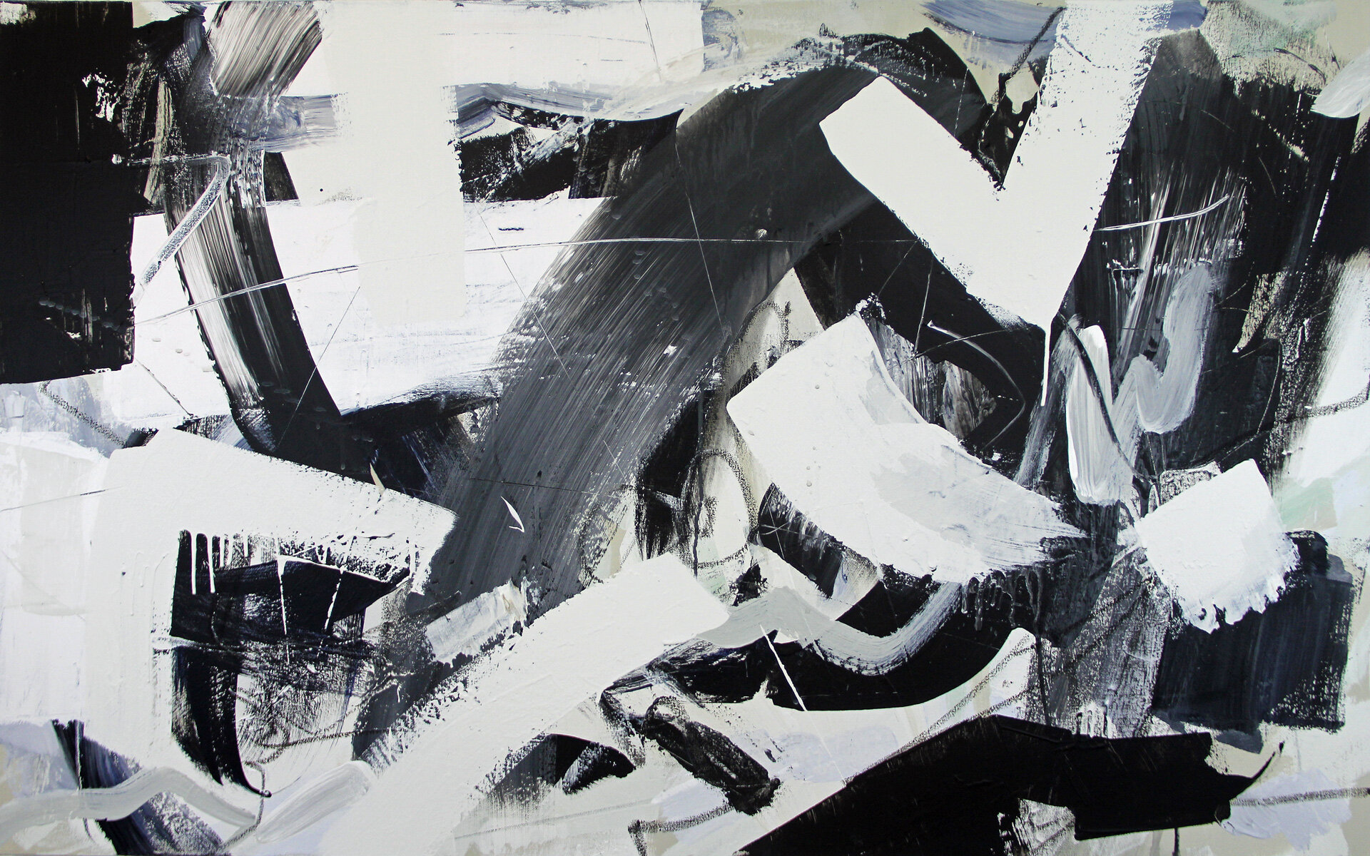
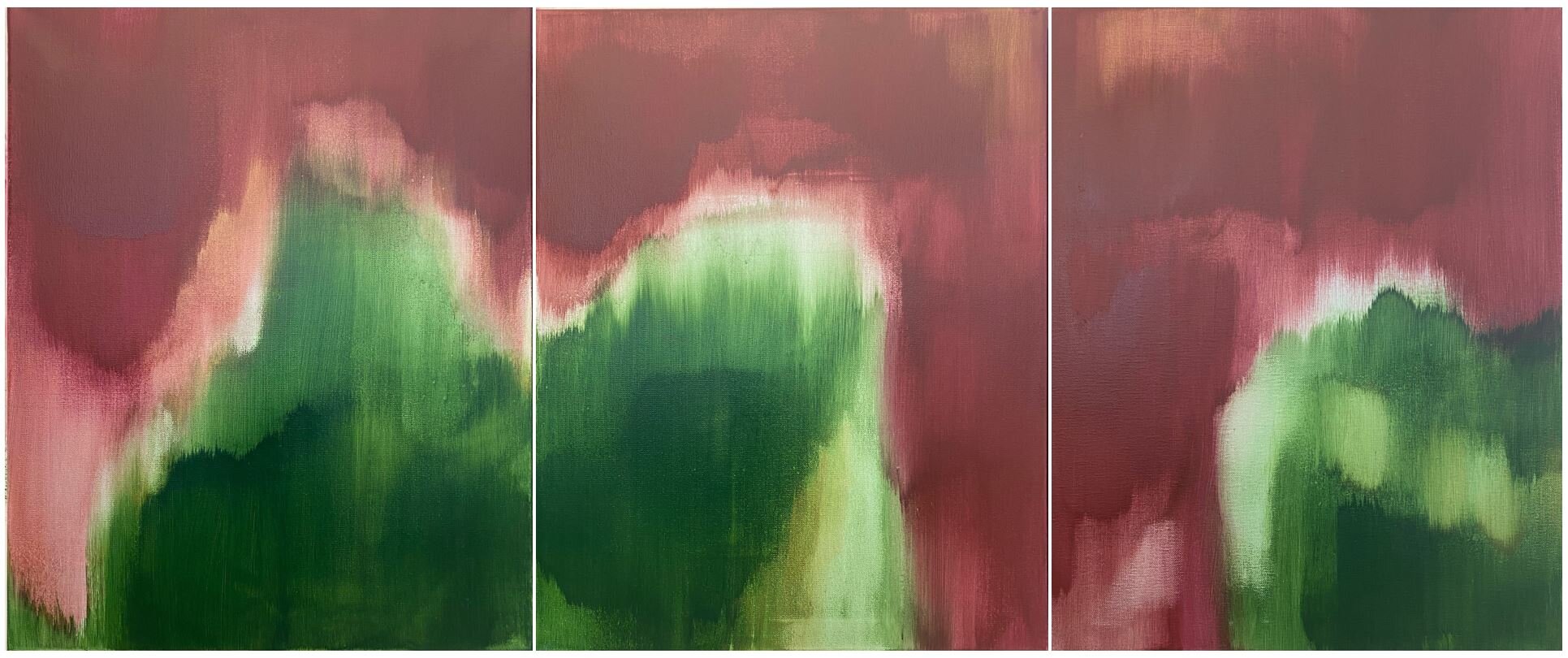
I like to borrow from all genres of abstract art in order to create an honest representation of the music. For instance, for Stravinski’s “Firebird” (Ref. #1), I chose a simple black and white, yet wildly gestural method of thickly brushed painting. Alternately, for the somber piece “Les Folies D’Espagne” by Marin Marais (Ref #2), I simplified the painting to two or three, dark colors; I used the acrylic paint as one would use water colors and stained the canvas with large, flowy shapes. Not all music is the same, so I cannot paint in the same style all the time. SHOP SHANY PORRAS ➢
Anne Russell
When I don’t have any ideas, or too many ideas, or feel otherwise “stuck,” I go back to basics and “just look around and draw something.” I feel most comfortable starting from direct observation, but with multiple layers and changing viewpoints and some invited chaos, the end results might be more abstract than not.
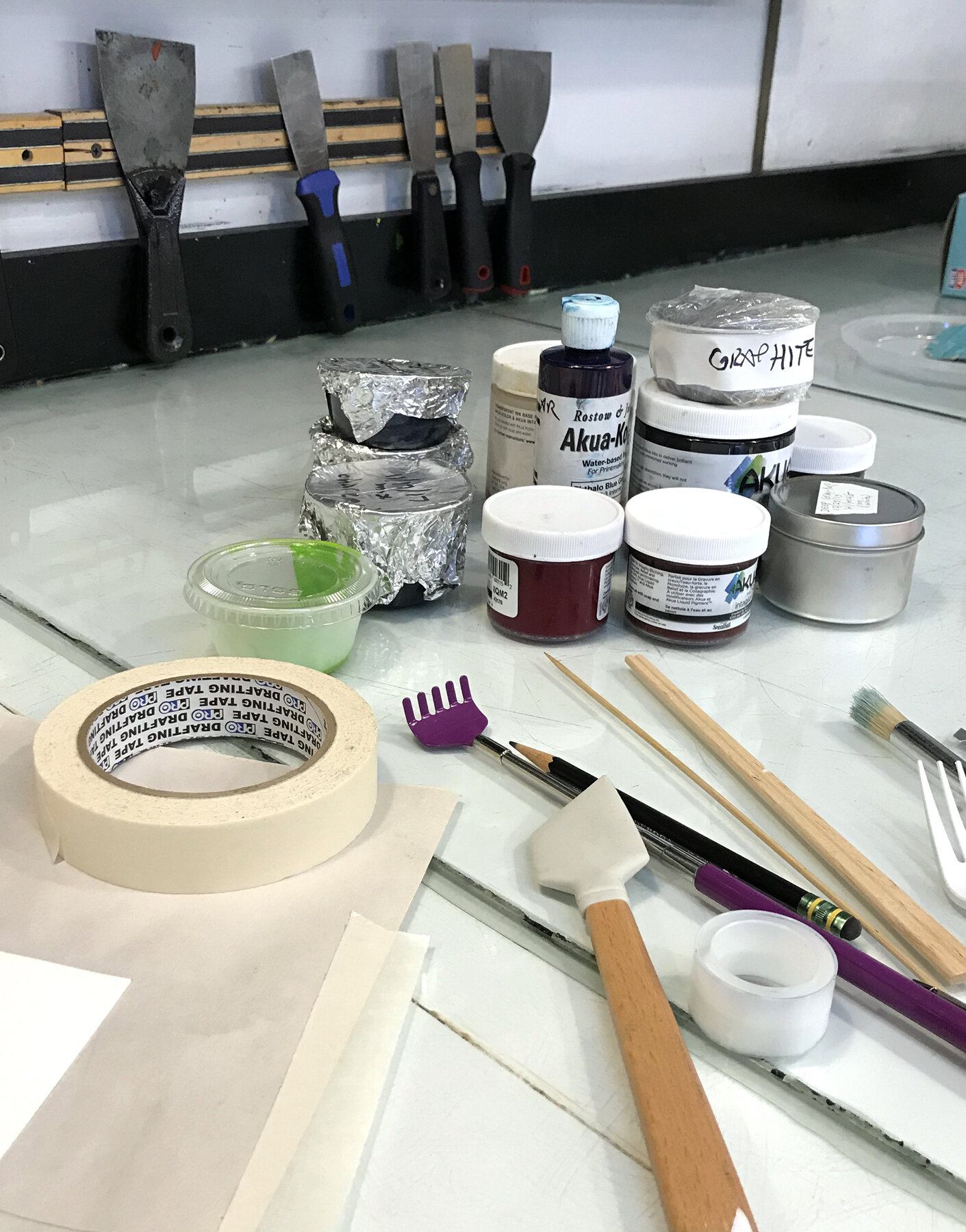
Moving around, blind contour drawing and listening to some favorite music are reliable ways to get focused-but-loose, engaged with the subject, and curious about what will happen next. Paul Klee’s quote, “Drawing is taking a line for a walk,” really resonates. When I got “stuck” in my printmaking, trace monotype seemed like a good way to translate that drawing approach and get things moving. What is trace monotype?
Roll ink on a smooth surface. Lay paper face down over the ink. Touch the back of the paper and some ink will transfer to it. You have made a unique print!
In a nutshell, this is trace monotype. It sounds almost silly-simple. But as with so many things, the devil is in the details.
What kind of ink?
(sticky? runny? one color? many colors?)
What kind of paper?
(thin, thick, smooth, textured, or cloth, or plastic, or…?)
What smooth surface?
(a typical printing plate, a tabletop, another sheet of paper, or…?)
What touches the back of the paper?
(a pencil, fingers, chopstick, rubber stamp, spatula, dog’s chew toy, or…?)
Is the touch hard or soft?
(greater pressure yields a darker mark on the paper)
All of these variables will affect the look of the print. Trace techniques can be used alone or combined with any other print process for seemingly endless possibilities.
After the initial tracing is done, the ink remaining on the plate holds a reversed version of the image, which can be printed on another sheet of paper with a press. I call these “negative-trace” monotypes. Some of them remind me of old blackboards with layers of partially erased marks. They evoke a sense of time passed and memories, and comprise the series called “Chalkboard Ghosts.” There are a few “Ghosts” in the Annex exhibit.
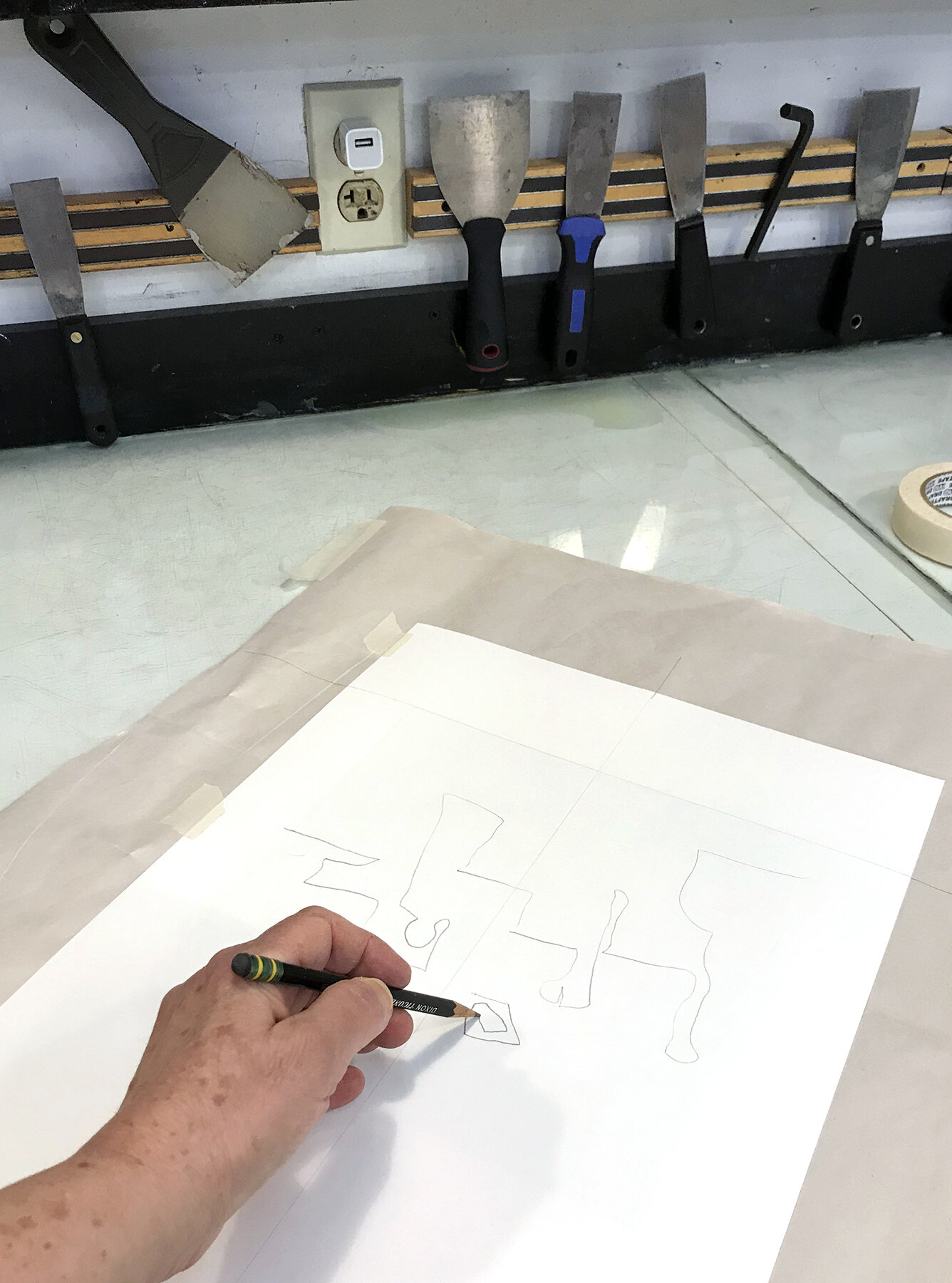
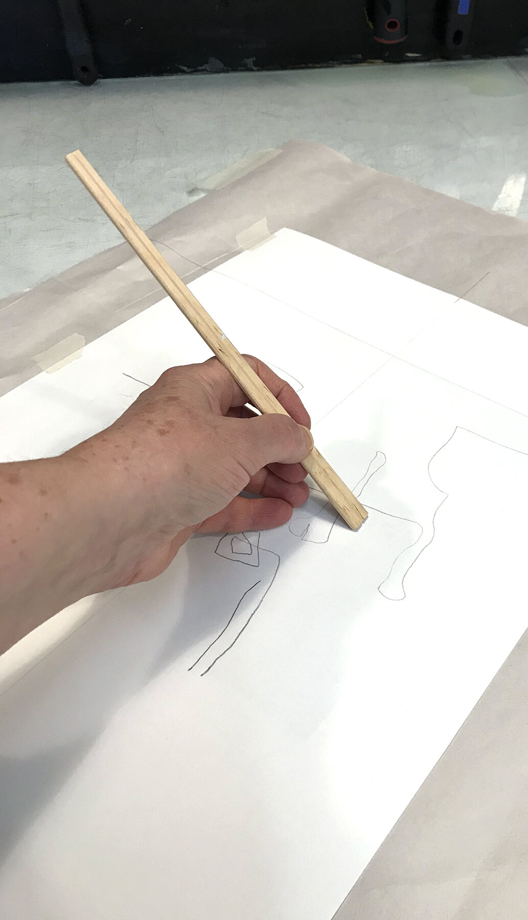
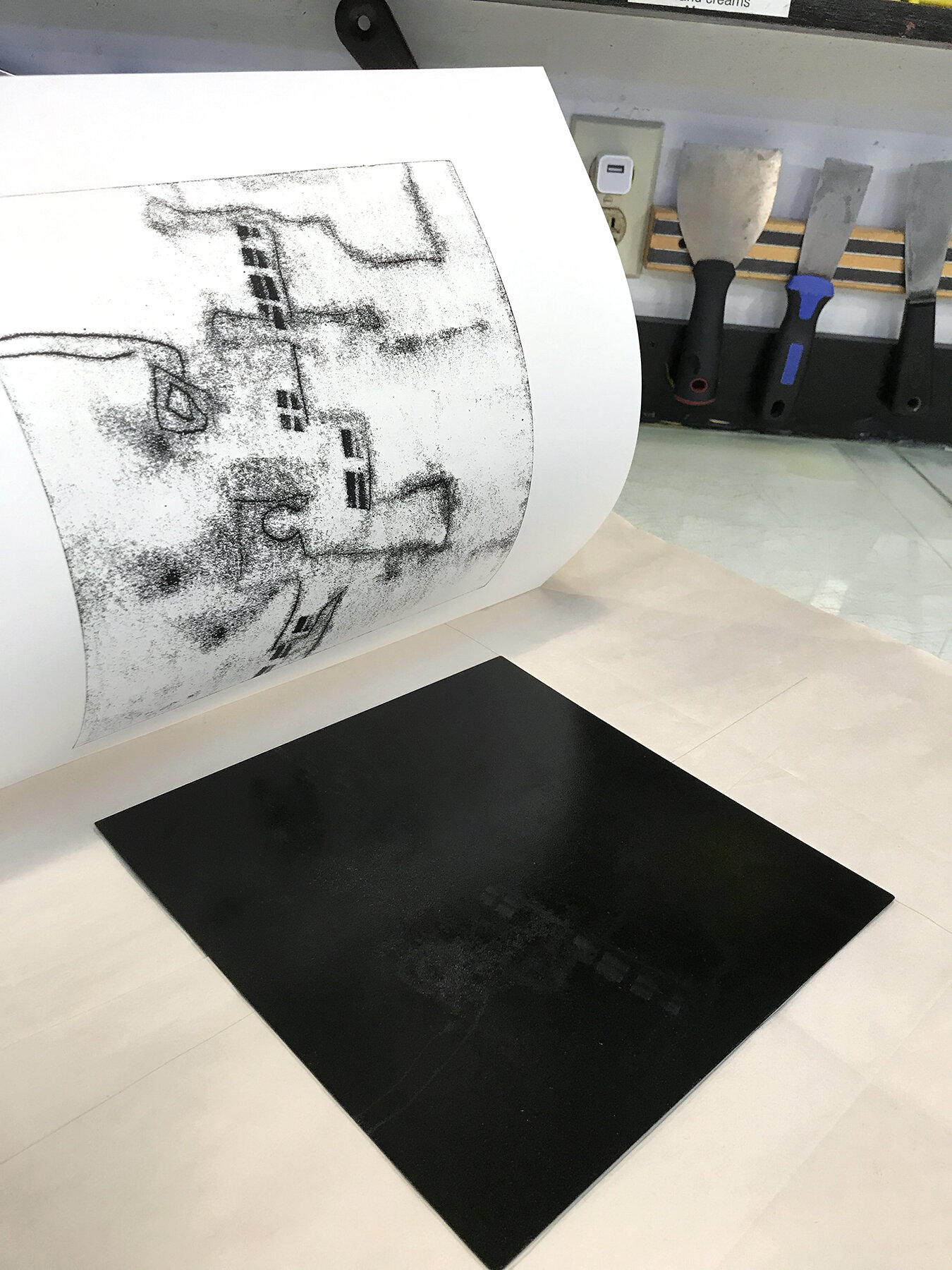
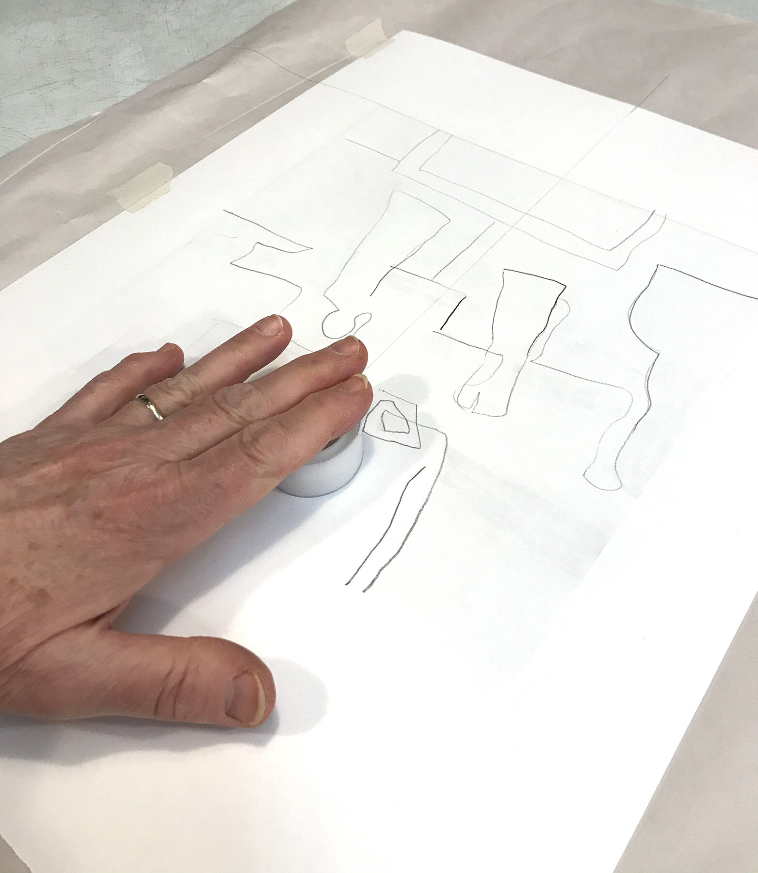
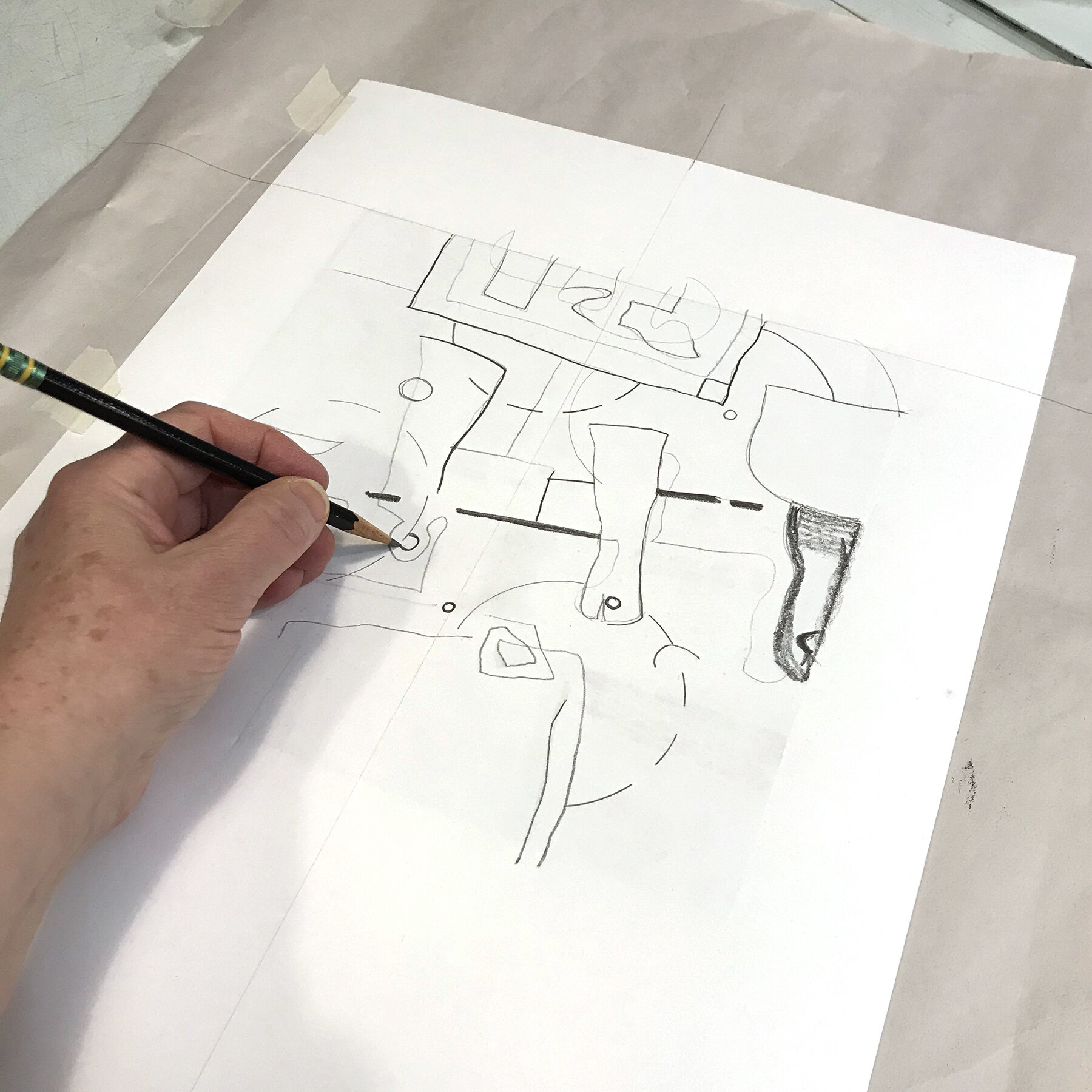
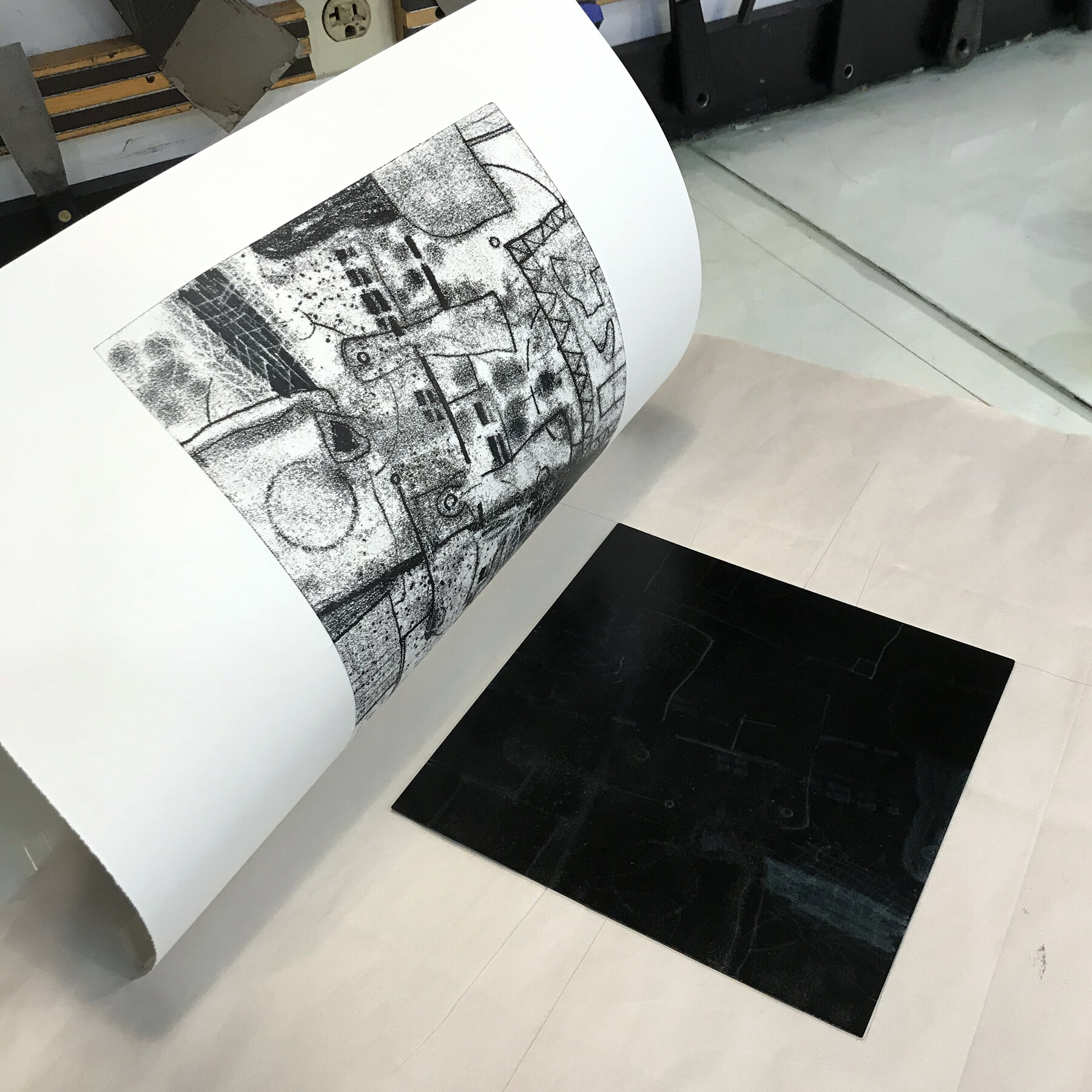
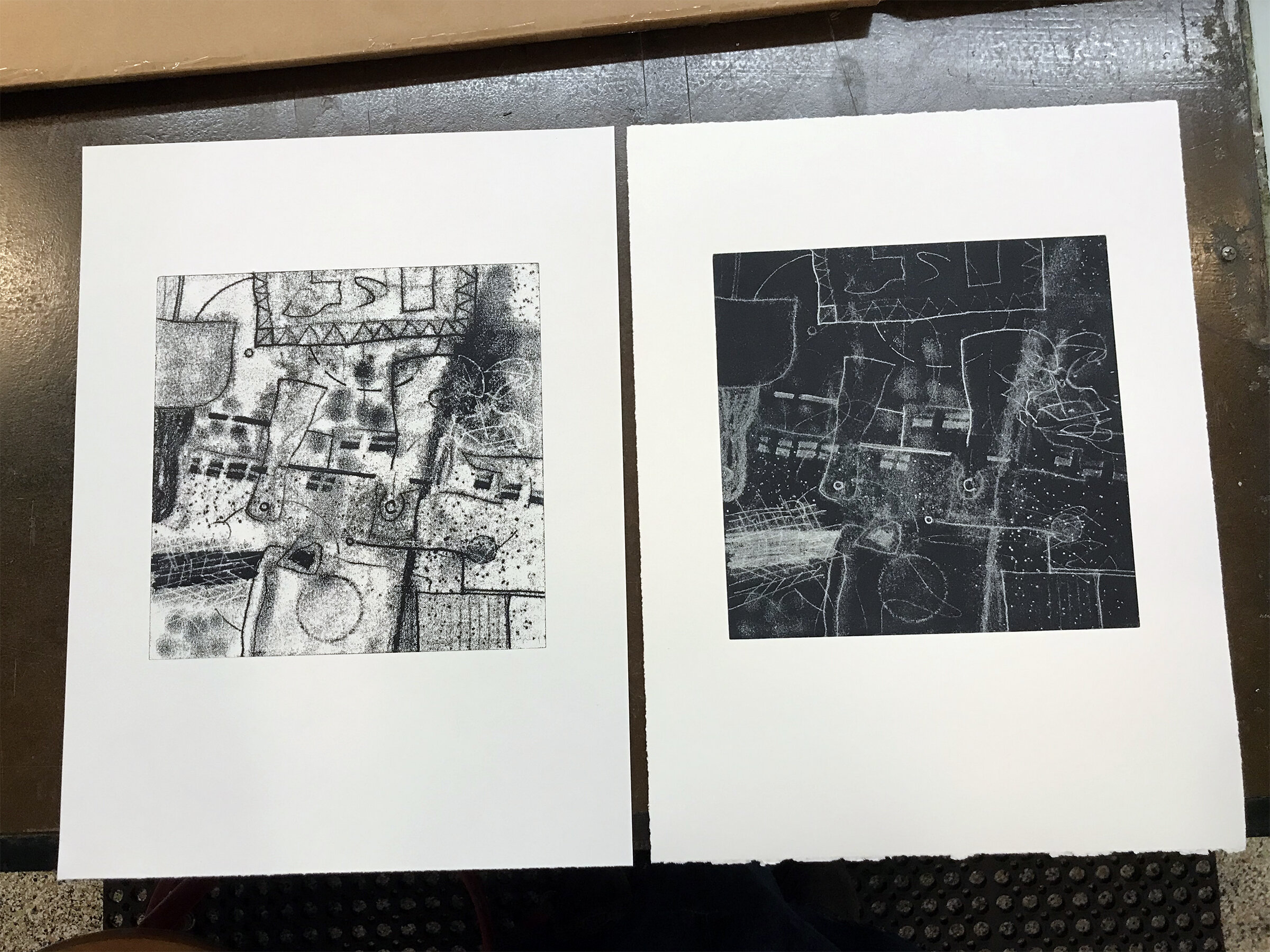
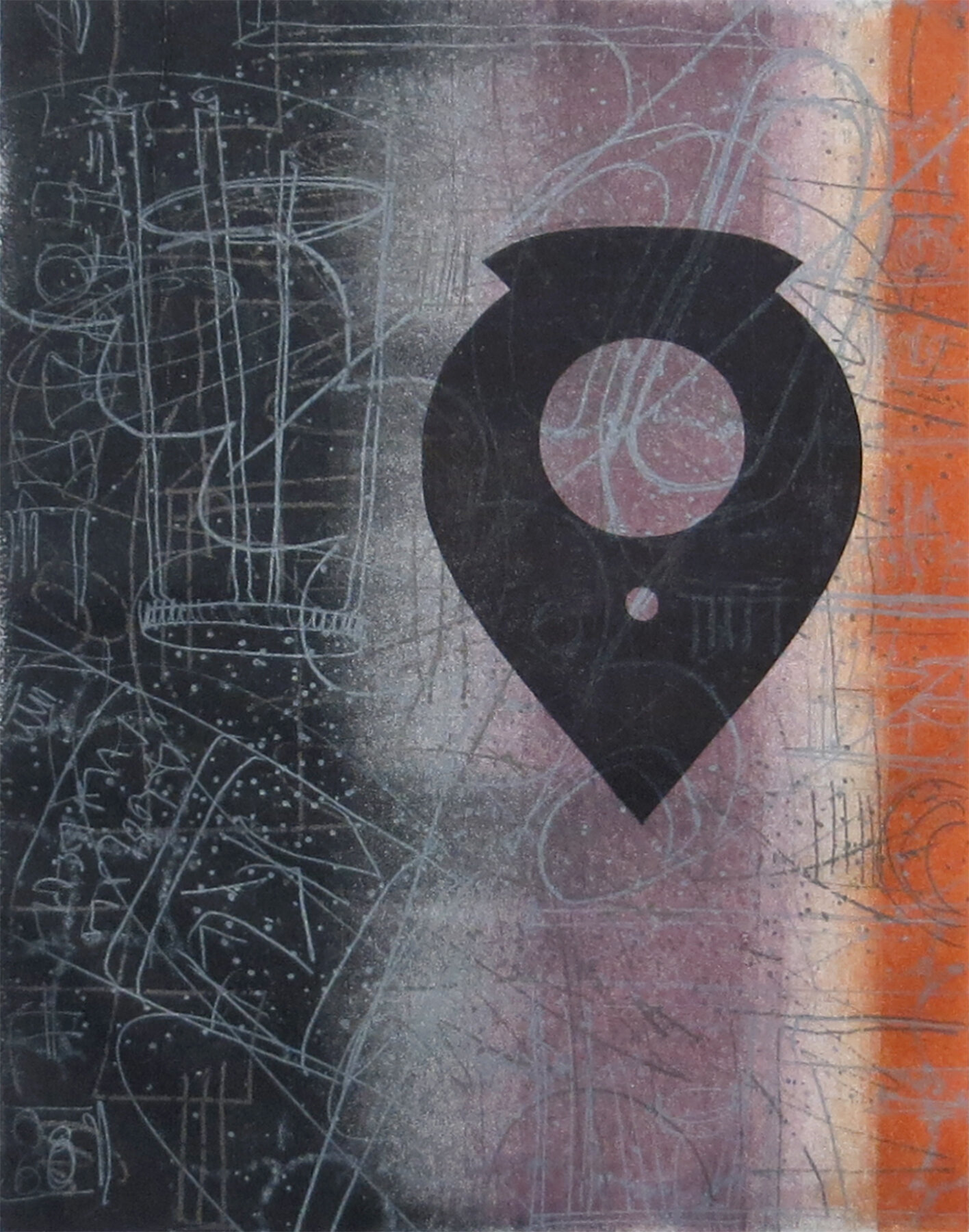
The photo sequence here (#1-8) shows a few steps in the progression of a trace monotype, then the resulting pair of positive and negative images. You may notice that there are not that many things drawn with the pencil – all of the other marks, shapes, and textures are made using objects that don’t leave a visible history on the back of the paper. I like the extra level of surprise this adds to the process, as I can choose how often to “peek” at how the image is developing. The final image (#9, titled “Plumb”) shows an evolution to adding more color and shape accents. SHOP ANNE RUSSELL ➢