October in the Annex
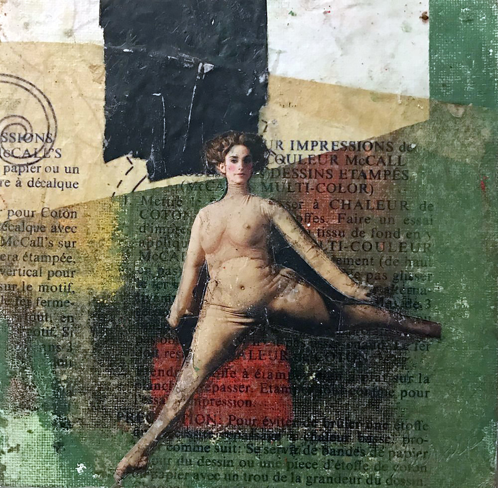
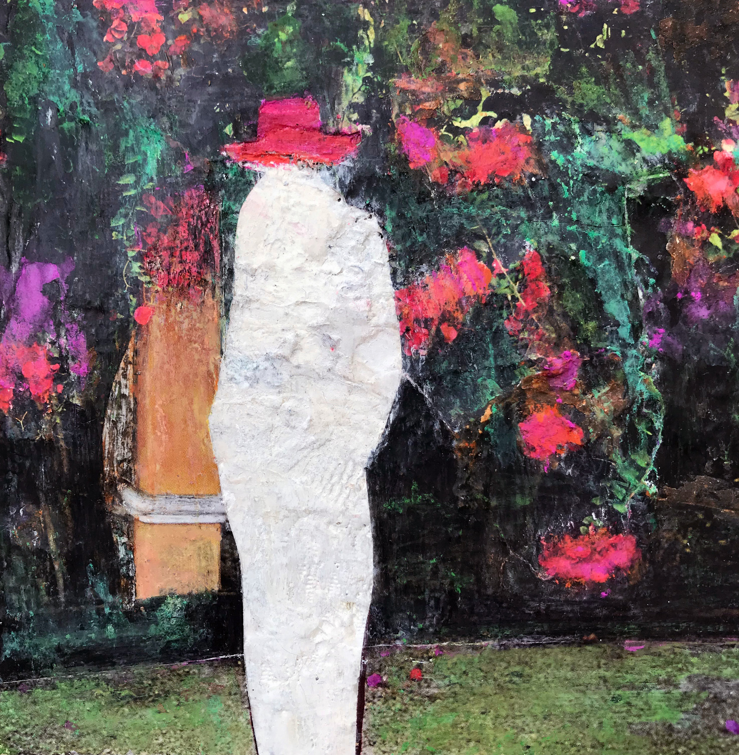
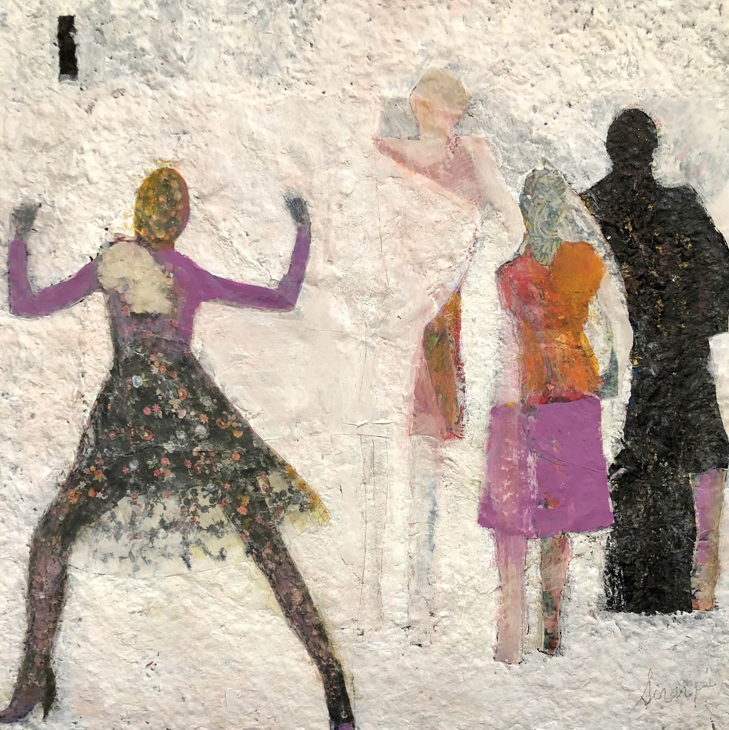
This October in the Annex Gallery we are featuring Monica DeSalvo, Sirarpi Heghinian-Walzer and Melissa Shaak. Their work will be on view through October 28, 2018. Below the artists talk about their ideas and process.
Monica DeSalvo
My recent works are mixed media pieces that are enlarged iterations of previous (tinier) original works. However, these recent works lie several generations from the originals.
Many Moons, gelatin monoprint, 8” x 12”
The process of making of “You should learn to talk in your head” started with a cropped gelatin monoprint “Many Moons” (8 x 12 inches) that I created in 2016. I then digitally enlarged it to approximately 24 x 36 inches, and had it printed onto an Art Vinyl substrate. The color and textures that were revealed were extremely vivid and had a tremendous variety of detail and texture. I collaged onto the enlarged image and digitally printed the finished collage onto Somerset Velvet, a digital stock with a watercolor finish. The new print was now a singular surface.
I preferred the coloration of the original collage on the vinyl, so I set out to enhance and sharpen the new print by going into the surface with colored pencil, pastel, and marker, trying to render it closer to the image on the vinyl.
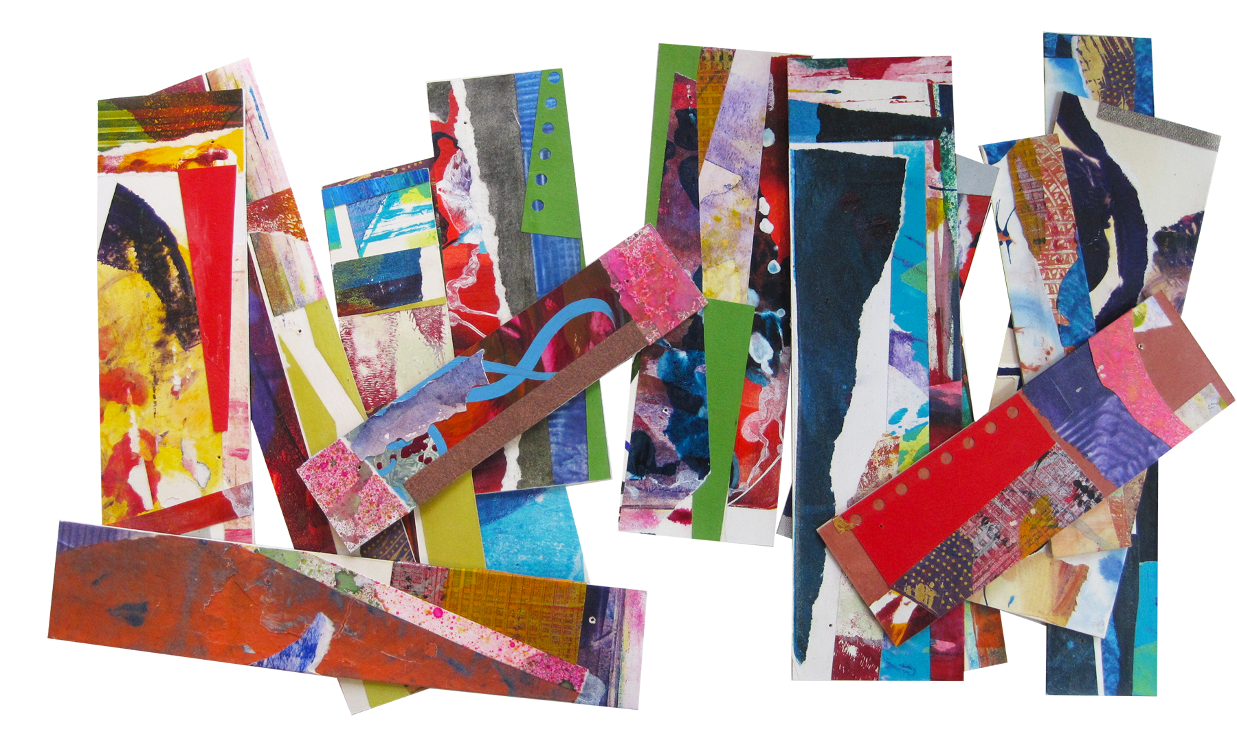
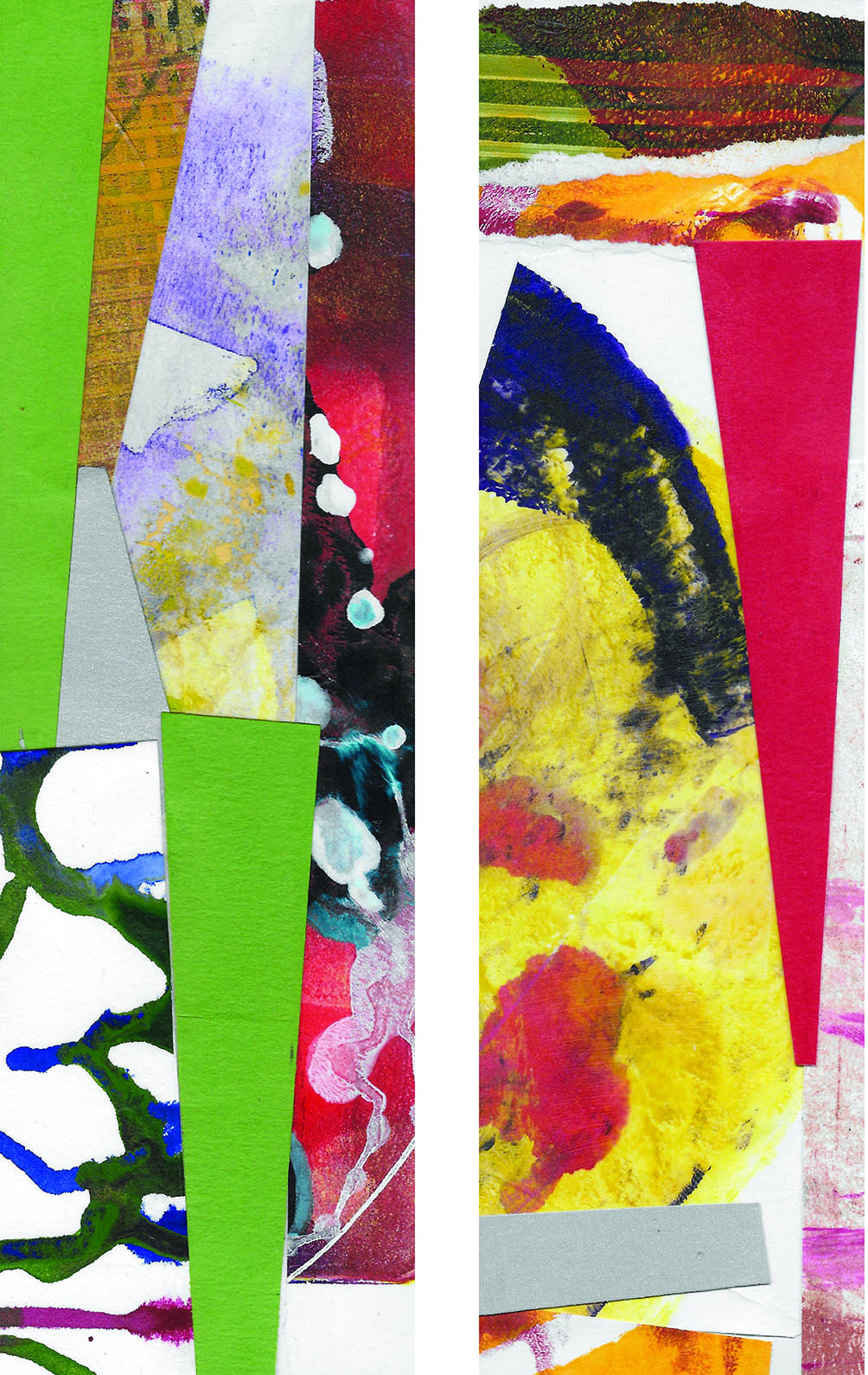
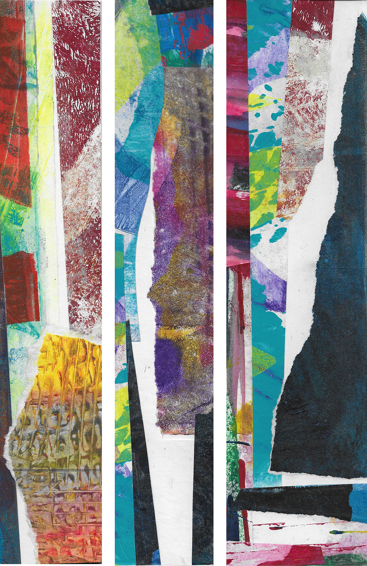
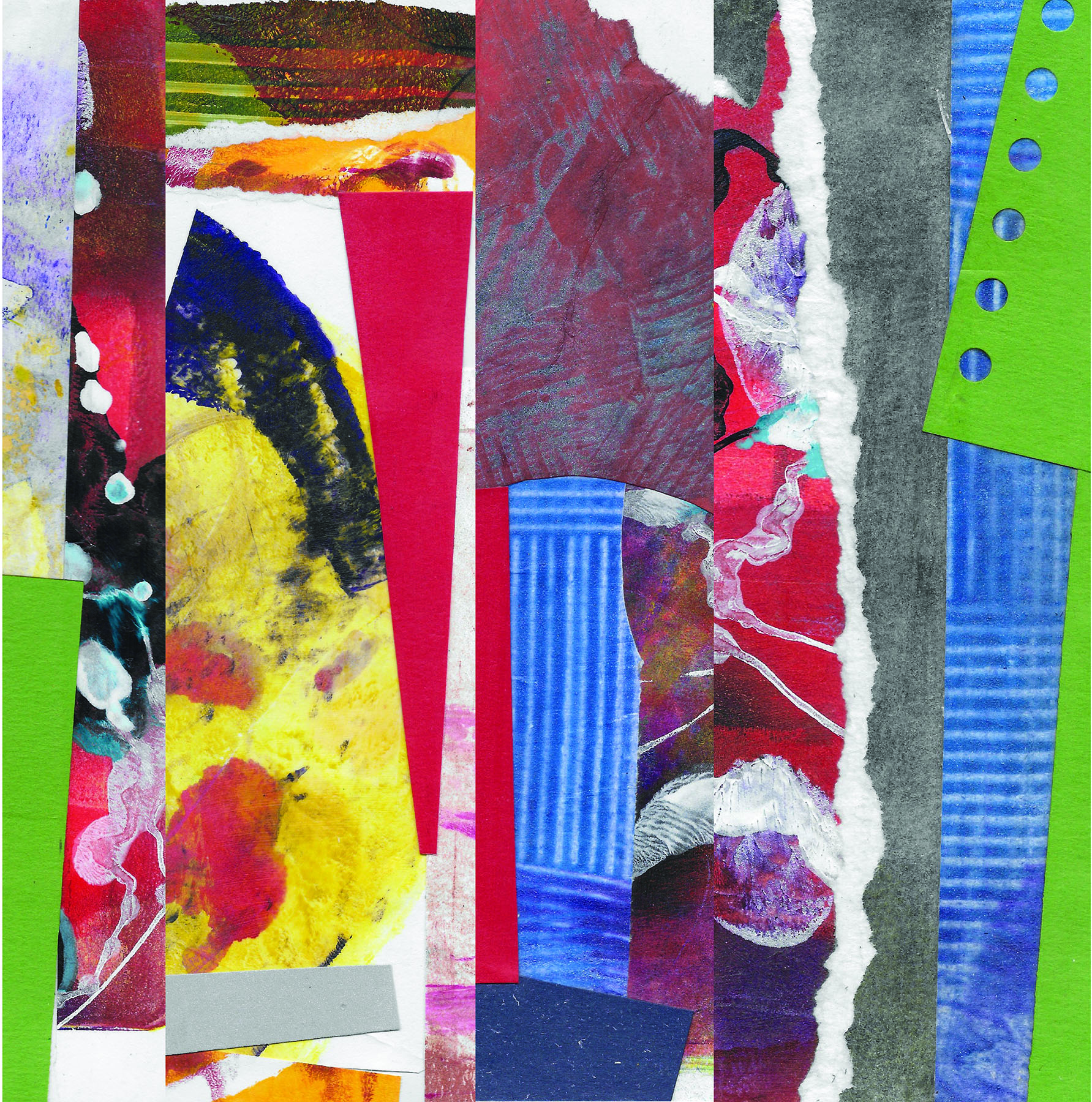
The same process was used for “Hawaiian Lollapalooza” and “The Red Book.” But, instead of starting from an intact gelatin monoprint, these two pieces were born from cropped out edges of older gelatin monoprints which I had collaged onto both sides of mat board remnants last year. Each individual “stick” is only 2-3 inches wide and range from 8-14 inches tall.
Each side of each stick was scanned, and I built files juxtaposing two or three images, manipulating the sizes so they were all the same length. These files were enlarged and digitally printed onto Somerset Velvet, collaged onto, printed again, and drawn into.
With “We didn’t take the plane—the plane took us!” the digital enlargement is on Stonehenge printmaking paper. Again I collaged directly onto the image and enhanced the image with pencil, pastel and marker. Since Stonehenge is not a digital stock, the colors print washed out, but the paper is very accepting of the additional media. No additional print was made.
My sticks provide endless inspiration. Over the past year, have been stacked, strung together into a book, taken apart, reassembled and rearranged over and over. It is like playing with building blocks, and I imagine them at enormous sizes providing backdrops in a number of environments.
Melissa Shaak
Last spring, I had the good fortune to hear a lecture by celebrated movie director Wim Wenders. Wenders described his film making efforts as, in my paraphrasing, fighting the traditional dominance of the story line. Why? To allow for the unexpected. To let other aspects emerge, which, he asserted, they would if given the space. To be able to receive artistic gifts as they unfolded—poetry in motion, he called it. I tucked these ideas away.
Through The Lines, acrylic and collage, 26” x 40”
Did my intrigue with Wenders’ contrasting the storyline with poetics influence my art-making? Or did it simply give me a useful framework, post-facto, to interpret what I had created? I’ve been puzzling about this question and can’t say for sure. But here is how things came together over the summer. I was experimenting with the color gray. I applied it in big, broad swaths overtop other paint. I found, as the gray was covering certain areas, that it also was illuminating and bringing focus to neighboring areas. What conceals also reveals.
I further discovered that I could enhance the effect by outlining the swaths in the color teal. The inspiration to try teal came from seeing the painting Grey Cells by John Howell White at PAAM (Provincetown Art Association and Museum). I continued my experimentation with these elements, working over formerly discarded paintings and pleased that I had found use for them in this new series. When I finally assembled the grouping and stepped back for a long look, Wenders immediately came to mind. I saw the big, almost primitive storyline represented by the gray outlined in teal. I also saw “gifts” emerging in adjacent areas—colors, texture, variety. I found the contrast compelling.
For me, it’s the contrast that gives the pieces their visual interest as well as their meaning. The contrast of the small-bore versus big, epic stories. The contrast of complex “villages” living vibrantly aside the myth. When I look at the paintings, I see above all this interplay. I believe it reflects a deeply-felt quest for balance, particular to these challenging times. What Wenders seeks to achieve in his films applies urgently to our own stories—how to allow more nuance to unfold amidst the arc of the storyline (aka “through line,” the title of the series), how to emerge from under the myth
Sirarpi Heghinian-Walzer
My abstract work springs both from meditations on nature and from memories that are distilled into single dramatic moments, they are the expression of emotions. The energetic surfaces imply an ongoing tension between freedom and containment.
Using oils, acrylics, ink and wax, I draw, scrawl, scrape and paint on surfaces that are rich in layers of papers, fabric, wood and other found materials. The layers of my collages ooze with life as I fix a moment of time.
